Rewriting Studio Logo History
I've been making my through the Michael Mann movies I'd never seen before. I was also dipping into movies featuring scores by electronic legends Tangerine Dream.
(More on these in the future, perhaps.)
With 1981's "Thief" - Mann's debut feature sporting absolutely wonderful music from Tangerine Dream - these two cinematic pursuits collided.
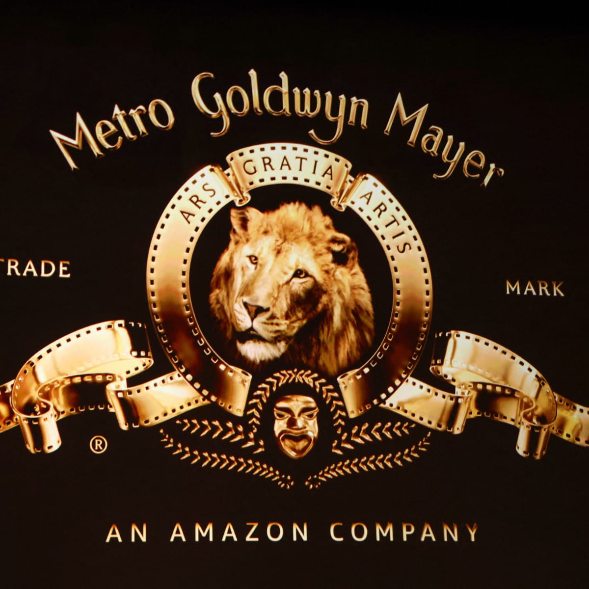
The first image on-screen is the MGM logo.
Perhaps the most famous of all movie logos?
But this was a weird take I'd not seen before. Shiny. CG. Animated with a zoom-out effect. And an additional bit of text:
An Amazon Company.
I get it: our retail overlord now owns what was once the most prestigious studio of Hollywood's Golden Age. But it still sucks to be reminded of it.
Not just for what it means for what’s becoming of movies. But for the disregard the current caretakers have for the legacy of these movies they now own.
Audiences who saw "Thief" in its original run didn't see "An Amazon Company." In fact, they may not have even seen an MGM logo at all: United Artists, the film’s original distributors, had not yet merged with MGM.
When old movies have new logos of the corporate parent du jour slapped on the front, it momentarily takes me out of the experience. I love seeing old-school title cards that match the vintage of the movie I'm about to watch. It's a thrill to get little glimpses of how a studio's logo had changed since the release of the movie you’re currently watching: the celebration of Paramount’s 75th anniversary, or the transition of the Universal globe from some sort of grainy optical effect to janky early CG.
And it's not just corporate owners putting their mark on movies they gained en masse as part of a move to satisfy their shareholders.
Disney movies practically all seem to get logo updates every few years. The distinct version of the Cinderella castle logo you might remember from watching your clamshelled VHS tapes has mostly been replaced by a computer-generated animated version rendered just recently.
Warner Bros deserves a shout-out for largely keeping original logos intact on their movies. Their movies have often featured unique takes on their logo that match the vibe or colors of what you're about to watch, and are often an inseparable part of a movie's opening. Not to mention the strange, less familiar versions of their logos like the Saul Bass-created "Warner Communications" logo or the "Seven Arts" version that both eschew the classic "WB" form.
I'm grateful every time I see a movie with something that looks like its original logo, at least as a momentary escape to an era before the current corporate consolidation and conglomerate gobbling up we’re watching now.